Insider 09-13-2017
In today’s Insider I’ll be talking a bit about the art direction process for the soon-to-be-released book Forces of HORDES: Skorne Command. As with all of the Command books, we followed two key tenets when determining the list of new illustrations we would need. The first was that every new model would get an illustration, and the second involved combing through the existing model entries to identify pieces that didn’t fit the modern aesthetic I’ve been developing over the last five years at Privateer.
Before I go into detail on the new art in the Skorne book, I want to briefly talk about how this process played out in previous Command books. The older Factions generally received a lot of new art as compared to a Faction like Retribution that already had a lot of more recent pieces. As a result, some Factions got more new art than others.
The three key reasons old art gets replaced are as follows:
– Image dimensions don’t fit within the current book layout.
– The art doesn’t match up stylistically with our current art.
– Narrative development.
So what do these points mean? The first is obvious, but the other two may need a bit of explanation. For the sake of expediency, a lot of older art was completed in a way that minimized the time spent by eliminating background characters, complex environments, and so on. My goal with new art is to create more of a narrative in the illustration where we see characters interacting within the world and we can visualize the setting more clearly.
For those of you wondering how the decisions to replace specific pieces of legacy art were made, I’ll discuss a few examples below and go into the reasons we targeted certain pieces and the thought process behind the art direction.
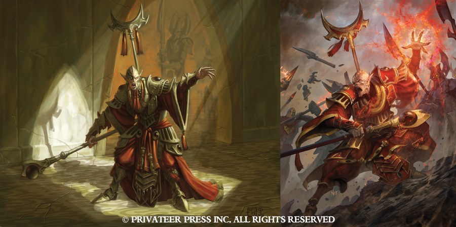
Supreme Aptimus Zaal and Kovass
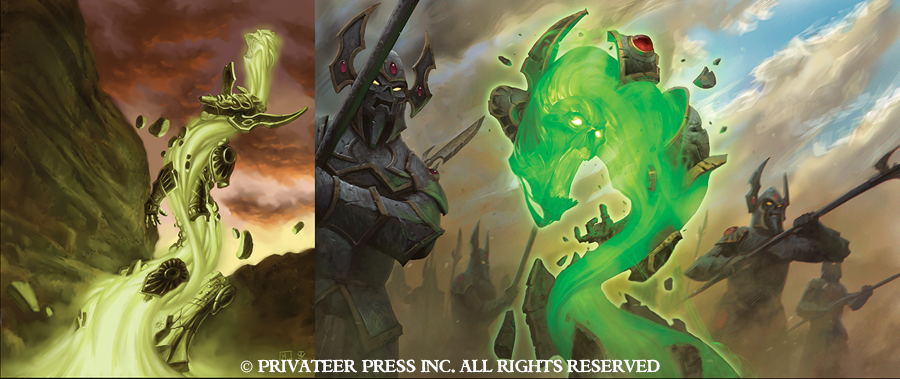
My goal with Zaal’s new illustration was both to create an image of Zaal in the middle of a fight and to come up with a way to tie his piece in with the Kovaas that would be seen on the following page. To do this, I have an Ancestral Guardian in the background of the Zaal illustration being taken down by a Temple Flameguard. The crumbling pieces then become the Kovaas in the second illustration.
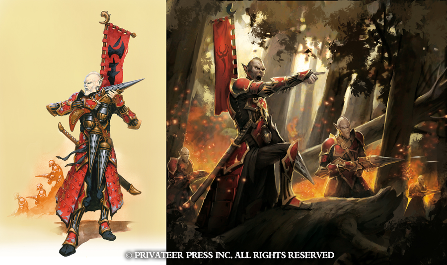
Venator Reivers
Aside from the image dimensions issue, the older art often lacked action and featured only minimal background. The legacy artwork nearly always placed the Faction within their native environments. Knowing that each of the Factions typically has some of its forces on the move, I wanted to start branching out into other locations in the setting and seeing the Skorne, for example, encounter WARMACHINE Factions. In the case of the Venator Reivers, I wanted a little tongue-in-cheek nod to the Retribution forces book where it seems every illustration has the forest on fire. The idea is that they’re over the Iosan peaks and have begun moving into the woods. Atmosphere in an illustration can go a long way, and those burning embers floating across the shot also helps establish a foreground, middle ground, and background.
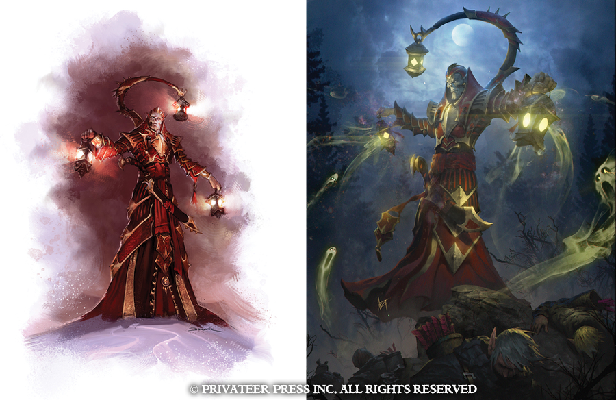
Void Seer Mordikaar
I apologize to the Ret players out there. I did pick on other Factions, but you’re now seeing two pieces in a row that highlight my campaign against the elves. I think that seeing these two examples side by side and reading the notes above, it’s obvious why we needed new art for this one.
The Skorne book is coming out very shortly, and there’s a lot more new art scattered throughout the book than I’ve showed here. I hope you’ve enjoyed gaining a little insight into the art direction process for this final Command book. For my next Insider, I’ll be going into some of the visual direction for the Trencher Theme Force art that you’ll be able to see in the upcoming first issue of No Quarter Prime!

